Visualising Data
- j.reades@ucl.ac.uk
1st October 2025
Start with a Chart (Part 2)
Building on Week 7, here are some deeper links between models and visualistions:
- What are we trying to model?
- What are we trying to penalise?
- What isn’t fitting into the model?

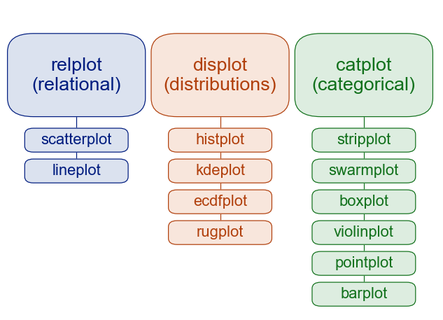
Plot Types
In Practice 2
Anatomy of a Figure

Adding a 3rd Dimension
This feature has many options though you’ll not get QGIS-quality output:
from mpl_toolkits.mplot3d import axes3d
ax = plt.figure().add_subplot(projection='3d')
X,Y,Z = axes3d.get_test_data(0.05)
# THEN
ax.plot_surface(X, Y, Z, edgecolor='royalblue', lw=0.5, rstride=8, cstride=8, alpha=0.3)
ax.contour(X, Y, Z, zdir='x', offset=-40, cmap='coolwarm')
ax.contour(X, Y, Z, zdir='x', offset=-40, cmap='coolwarm')
ax.contour(X, Y, Z, zdir='y', offset=40, cmap='coolwarm')
ax.set(xlim=(-40, 40), ylim=(-40, 40), zlim=(-100, 100),
       xlabel='X', ylabel='Y', zlabel='Z');
plt.show()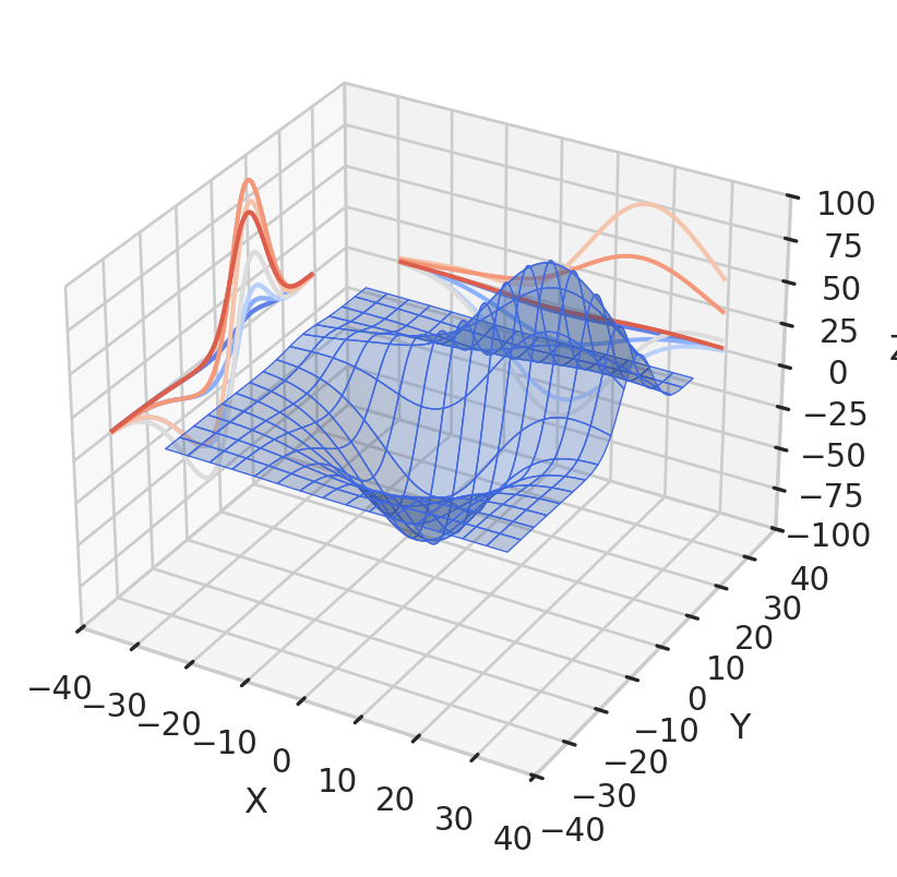
Widgets
Bokeh

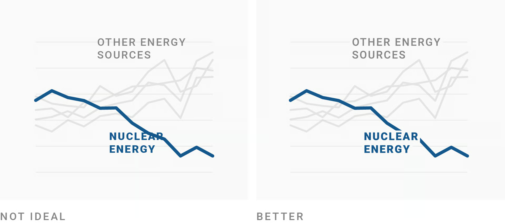
Don’t Underestimate Text!
Label directly1:
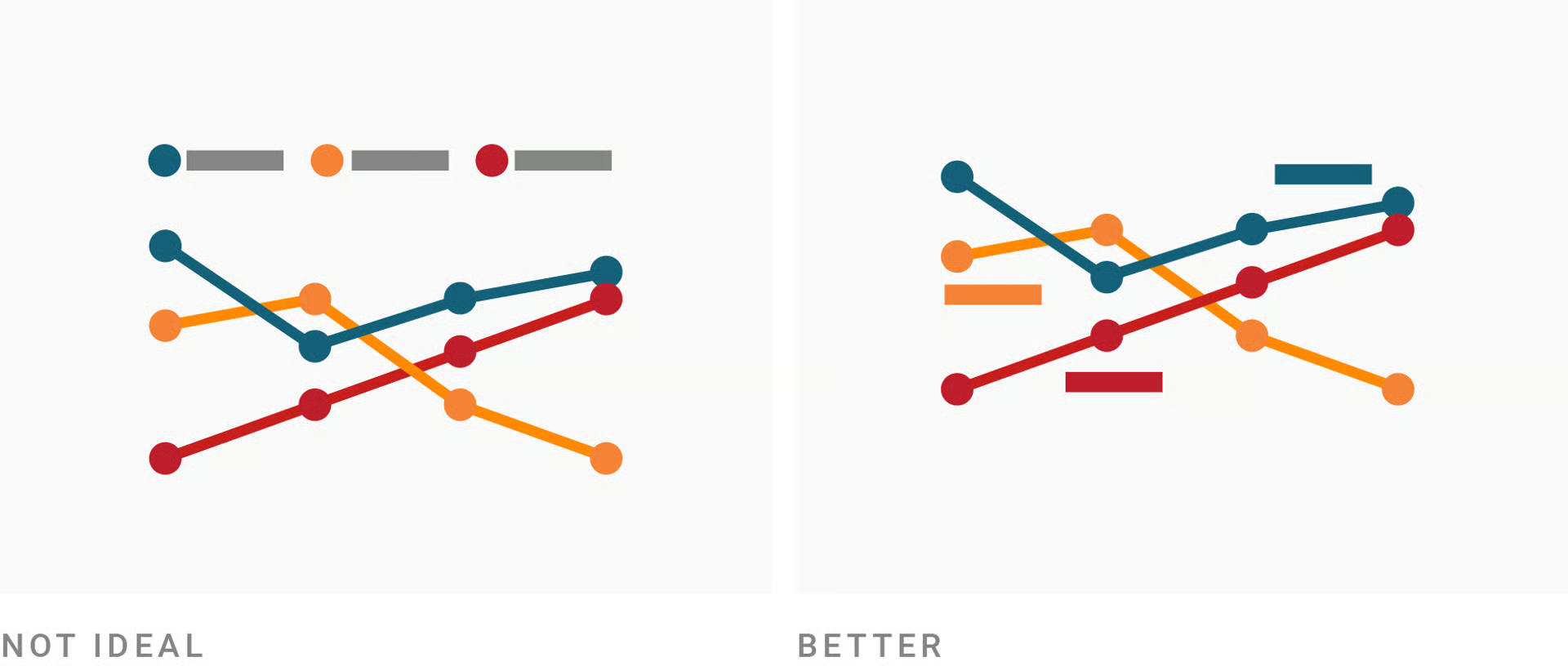
Don’t Underestimate Text!
Use outlines to allow overlaps1 2:
Don’t Underestimate Text!
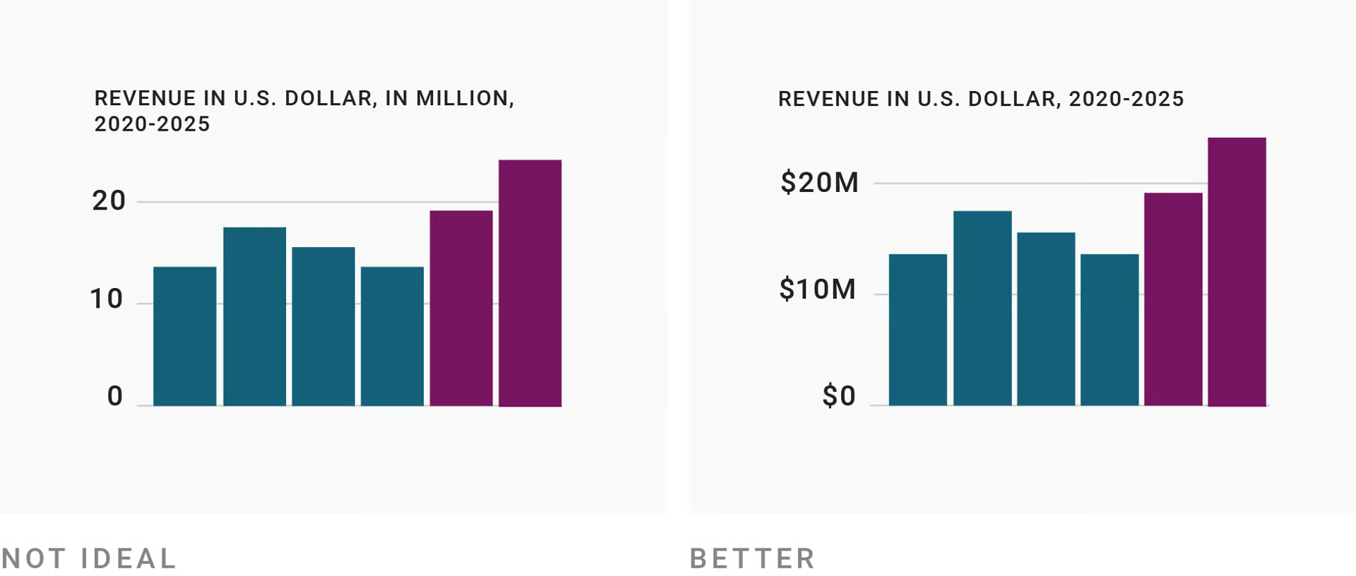
Repeat measurement units1 2:
Don’t Underestimate Text!
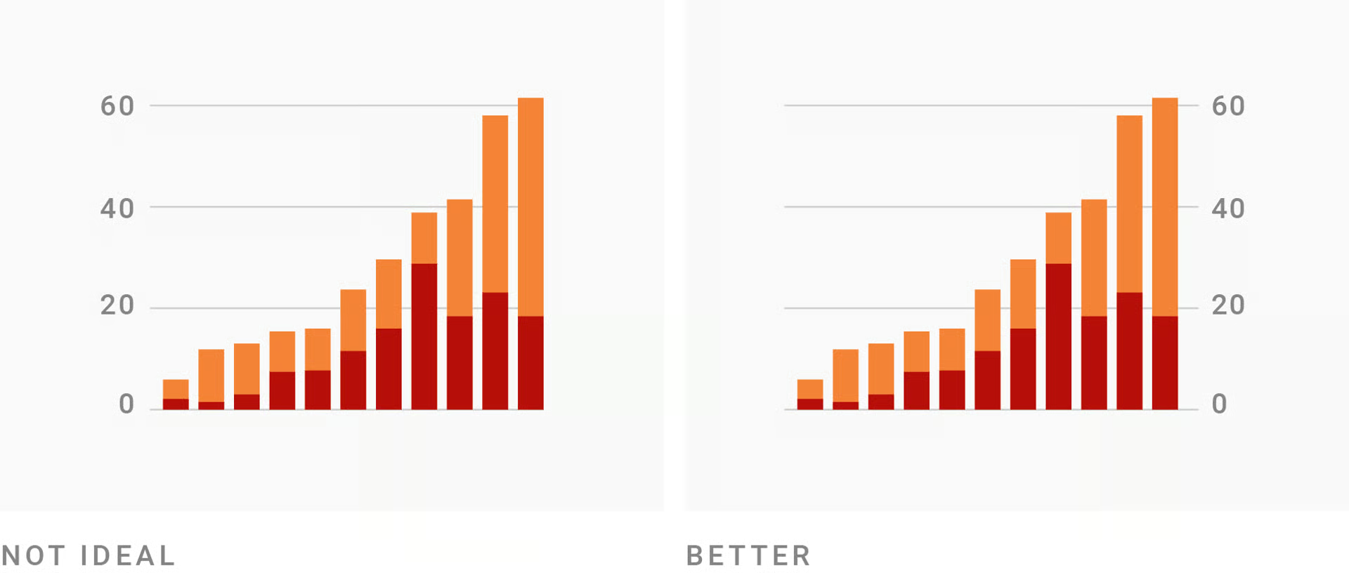
Put the axes where they’re needed1:
Don’t Underestimate Text!
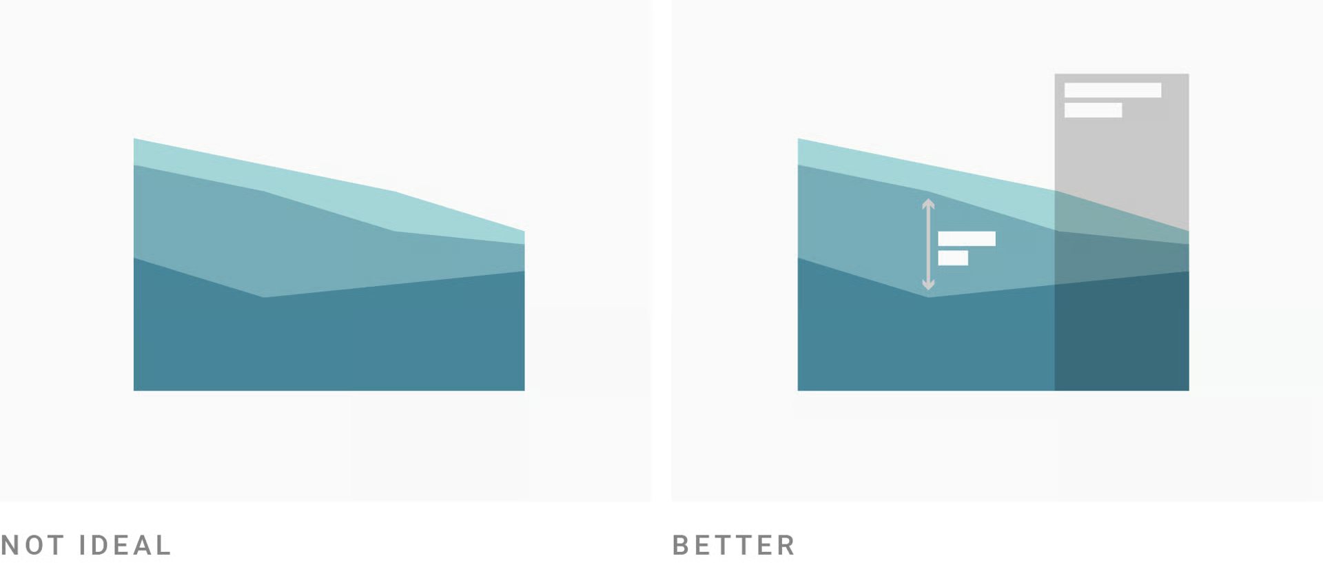
Emphasise and explain with annotation1:
Don’t Underestimate Text!
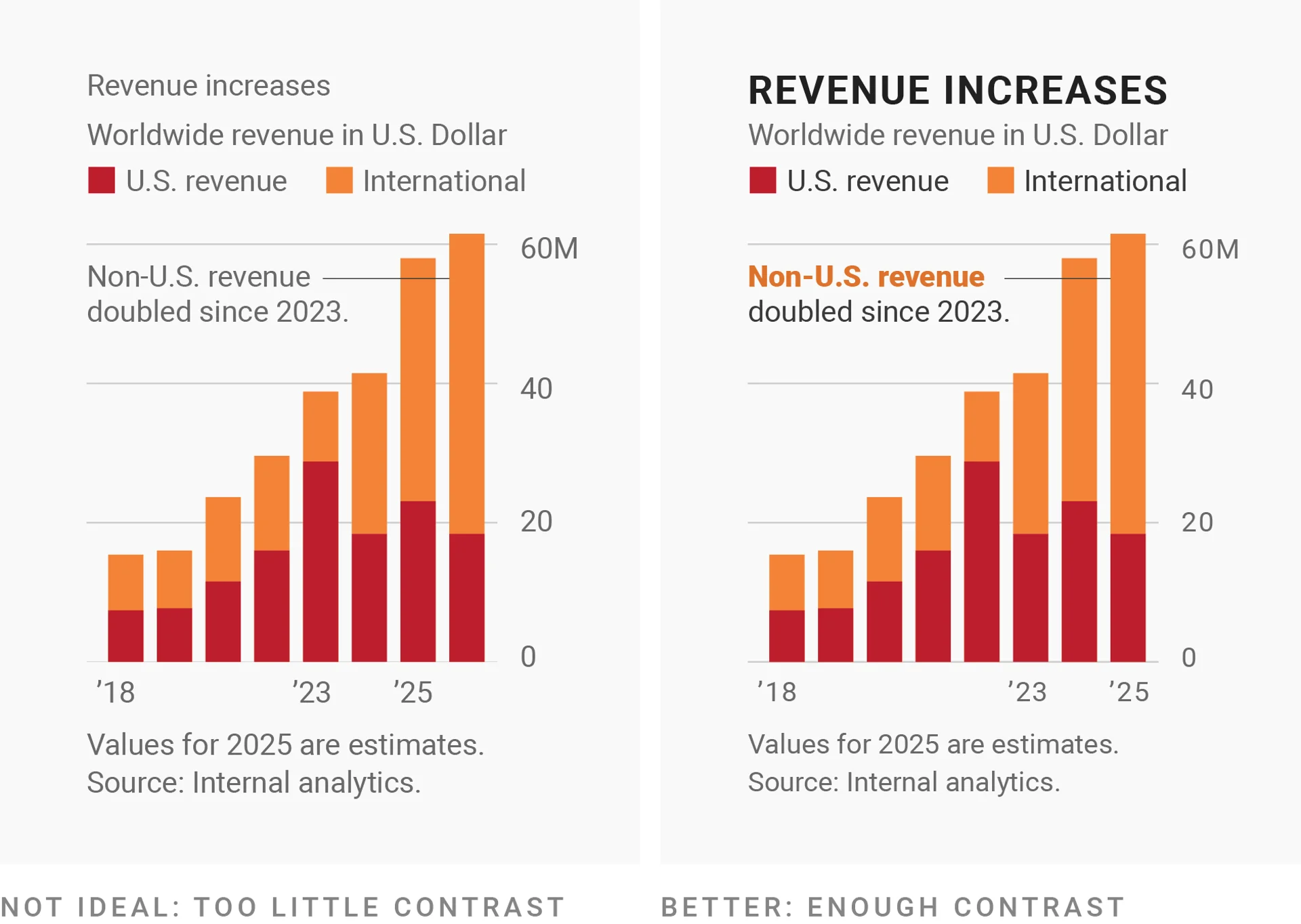
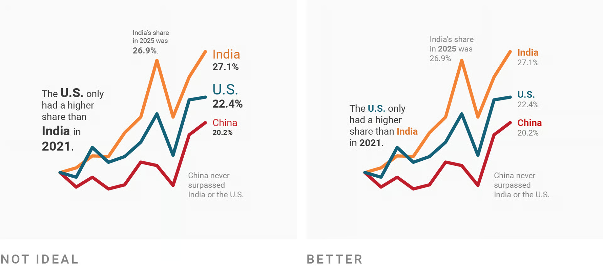
Lead the eye with font sizes, styles, and colors1 2:
Don’t Underestimate Text!
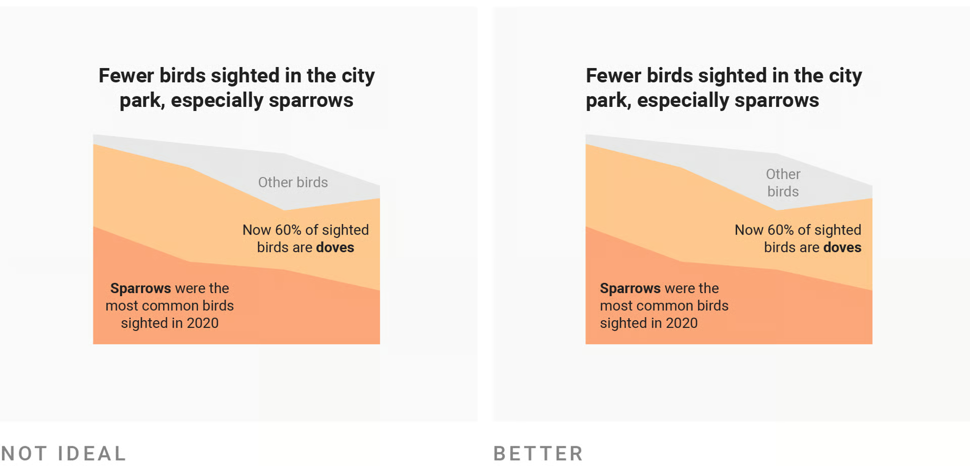
See what I said on the previous slide about ‘too much going on’1:
Don’t Underestimate Text!
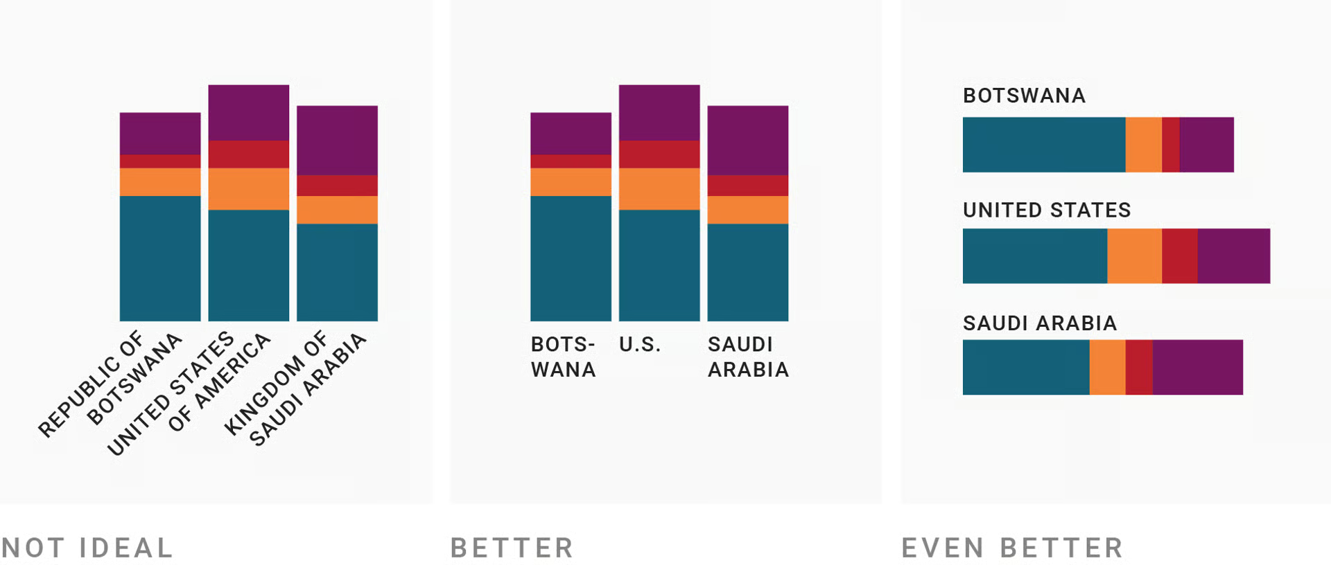
For the sake of all that is holy, please don’t center-align text1:
Don’t Underestimate Text!
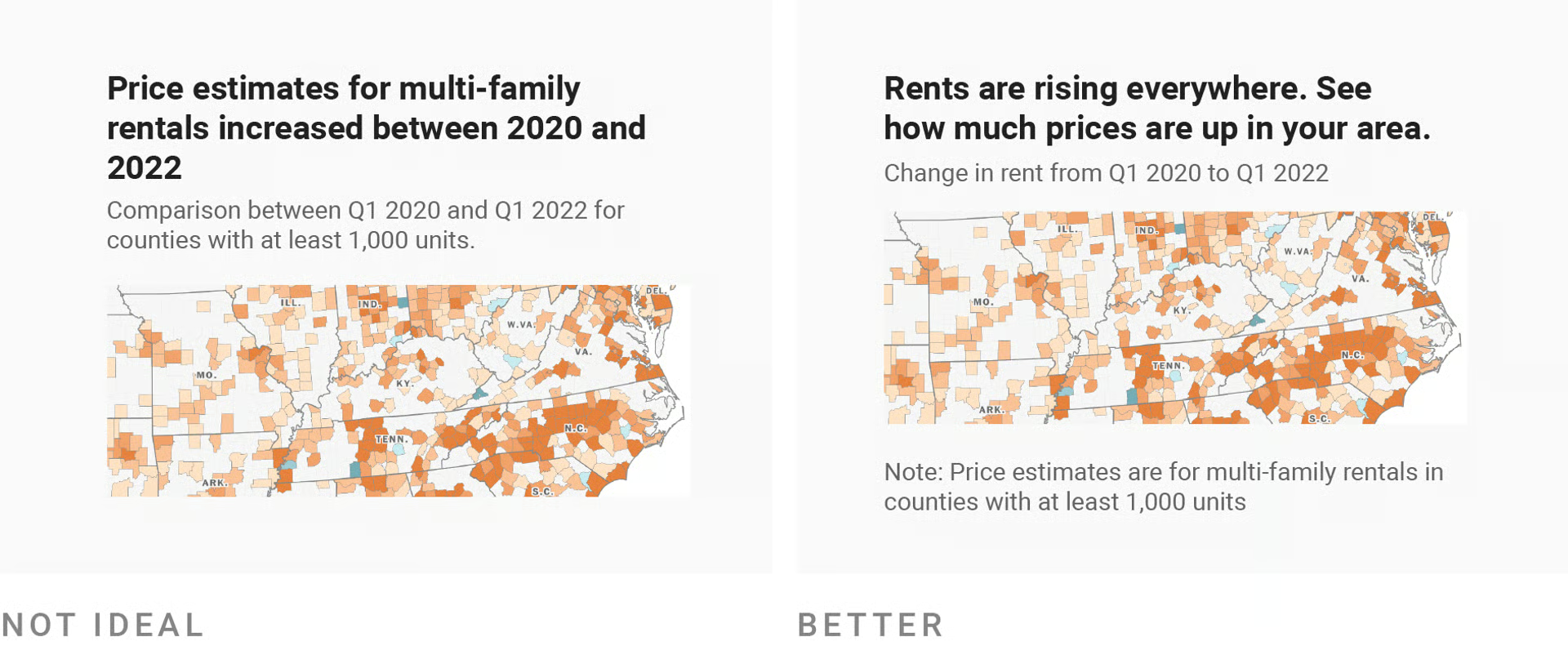
Make reading easy and interpretation intuitive1 2:
Don’t Underestimate Text!
Get to the point in a way that works for the reader1 2: