Signal & Noise
Jon Reades - j.reades@ucl.ac.uk
1st October 2025
What is it?

What is it?

What is it?

Start with a Chart
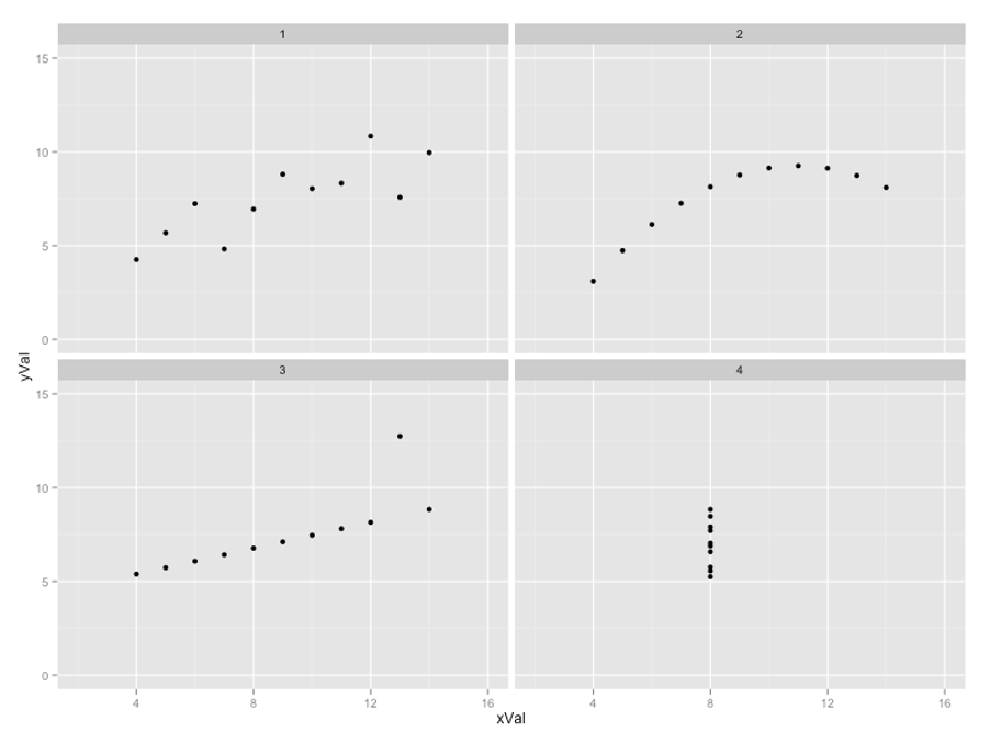
The problem of relying on statistics alone was amply illustrated by Anscombe’s Quartet (1973)…
- We are not very good at looking at spreadsheets.
- We are very good at spotting patterns visually.
Sometimes, we are too good; that’s where the stats comes in. Think of it as the ‘tiger in the jungle’ problem..
Anscombe’s Quartet
| X1 | Y1 | X2 | Y2 | X3 | Y3 | X4 | Y4 |
|---|---|---|---|---|---|---|---|
| 10.0 | 8.04 | 10.0 | 9.14 | 10.0 | 7.46 | 10.0 | 6.58 |
| 8.0 | 6.95 | 8.0 | 8.14 | 8.0 | 6.77 | 8.0 | 5.76 |
| 13.0 | 7.58 | 13.0 | 8.74 | 13.0 | 12.74 | 13.0 | 7.71 |
| 9.0 | 8.81 | 9.0 | 8.77 | 9.0 | 7.11 | 9.0 | 8.84 |
| 11.0 | 8.33 | 11.0 | 9.26 | 11.0 | 7.81 | 11.0 | 8.47 |
| 14.0 | 9.96 | 14.0 | 8.10 | 14.0 | 8.84 | 14.0 | 7.04 |
| 6.0 | 7.24 | 6.0 | 6.13 | 6.0 | 6.08 | 6.0 | 5.25 |
| 4.0 | 4.26 | 4.0 | 3.10 | 4.0 | 5.39 | 4.0 | 12.5 |
| 12.0 | 10.84 | 12.0 | 9.13 | 12.0 | 8.15 | 12.0 | 5.56 |
| 7.0 | 4.82 | 7.0 | 7.26 | 7.0 | 6.42 | 7.0 | 7.91 |
| 5.0 | 5.68 | 5.0 | 4.74 | 5.0 | 5.73 | 5.0 | 6.89 |
Summary Statistics for the Quartet
| Property | Value |
|---|---|
Mean of x |
9.0 |
Variance of x |
11.0 |
Mean of y |
7.5 |
Variance of y |
4.12 |
Correlation between x and y |
0.816 |
| Linear Model | y = 3 + 0.5x |
But What do They Look Like?
The Tiger that Isn’t
I would argue that the basic purpose of charts and of statistics as a whole is to help us untangle signal from noise. We are ‘programmed’ to see signals, so we need to set the standard for ‘it’s a tiger!’ quite high in research & in policy-making.
Think it Through
You can make a lot of progress in your research without any advanced statistics!
- A ‘picture’ isn’t just worth 1,000 words, it could be a whole dissertation!
- The right chart makes your case eloquently and succinctly.
Always ask yourself:
- What am I trying to say?
- How can I say it most effectively?
- Is there anything I’m overlooking in the data?
A good chart is a good way to start!
What Makes a Good Plot?
A good chart or table:
- Serves a purpose — it is clear how it advances the argument in a way that could not be done in the text alone.
- Contains only what is relevant — zeroes in on what the reader needs and is not needlessly cluttered.
- Uses precision that is meaningful — doesn’t clutter the chart with needless numbers.
For Example…
How much precision is necessary in measuring degrees at the equator?
| Decimal Places | Degrees | Distance |
|---|---|---|
| 0 | 1 | 111km |
| 1 | 0.1 | 11.1km |
| 2 | 0.01 | 1.11km |
| 3 | 0.001 | 111m |
| 4 | 0.0001 | 11.1m |
| 5 | 0.00001 | 1.11m |
| 6 | 0.000001 | 11.1cm |
| 7 | 0.0000001 | 1.11cm |
| 8 | 0.00000001 | 1.11mm |
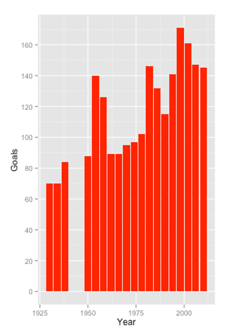
Goals by World Cup Final
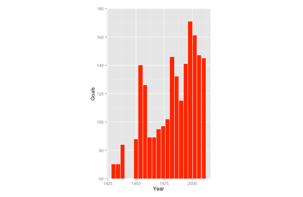
Goals by World Cup Final
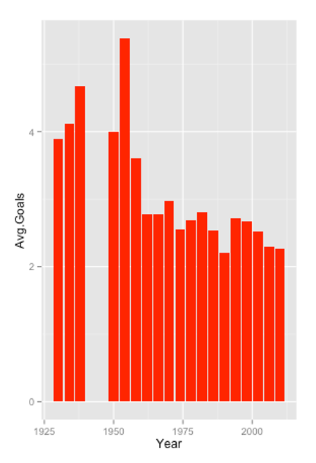
Average Goals by World Cup Final
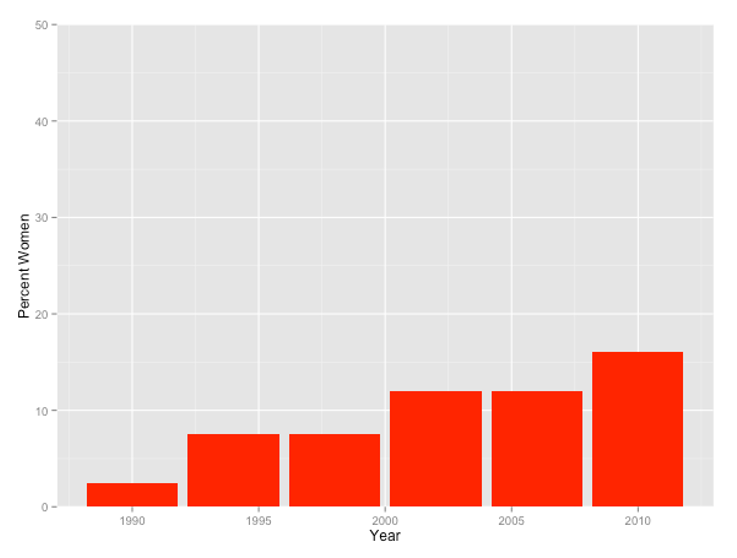
How far from Equality?
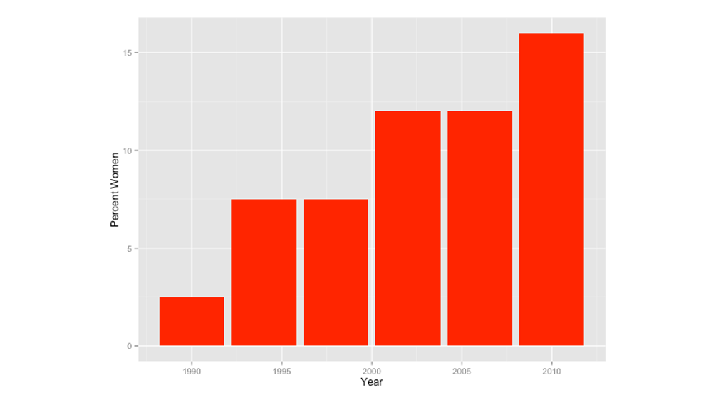
How far from Equality?
The Purpose of a Chart
The purpose of a graph is to show that there are relationships within the data set that are not trivial/expected.
Choose the chart to highlight relationships, or the lack thereof:
- Think of a chart or table as part of your ‘argument’ – if you can’t tell me how a figure advances your argument (or if your explanation is more concise than the figure) then you probably don’t need it.
- Identify & prioritise the relationships in the data.
- Choose a chart type/chart symbology that gives emphasis to the most important relationships.
If a picture is worth 1,000 words, make sure those words aren’t “blah, blah, blah…”
Not Everyone Likes Tables
Getting information from a table is like extracting sunlight from a cucumber. Arthur & Henry Fahrquhar (1891)
Real Numbers
Consider the difference in emphasis between:
- 11316149
- 11,316,149
- 11.3 million
- 11 x 10\(^{6}\)
- 22%
- 22.2559%
Always keep in mind the purpose of the number.
There’s Still a Role for Tables
Why a table is sometimes better than a chart:
- You need to present data values with greater detail
- You need to enable readers to draw comparisons between data values
- You need to present the same data in multiple ways (e.g. raw number and percentage)
- You want to show many dimensions for a small number of observations
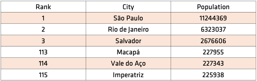
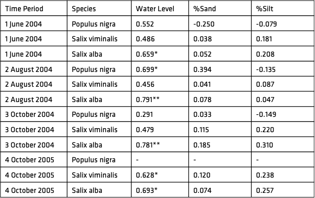
Undergraduate Tables (Failing Grade)
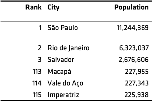
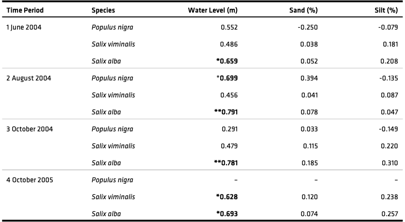
Undergraduate Tables (Passing Grade)
Postgraduate Tables (Failing Grade)
Postgraduate Tables (Passing Grade)
Design for Tables
Principles:
- Reduce the number of lines to a minimum (and you should almost never need vertical lines).
- Use ‘white-space’ to create visual space between groups of unrelated (or less related) elements.
- Remove redundancy (if you find yourself typing ‘millions’ or ‘GBP’ or ‘Male’ repeatedly then you’ve got redundancy).
- Ensure that meta-data is clearly separate from, but attached to, the graph (i.e. source, title, etc.).
Additional Resources
There’s so much more to find, but: