Mapping Gentrificaiton!
In Part 1, we simply ‘played around’ with the house price data for 2001, now I want you to think a lot more carefully about this data set.
1 Distributions
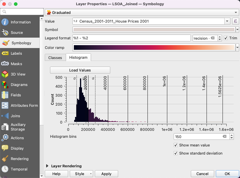
Right-click on the Joined LSOA layer and pick Properties… again
- Under
Symbology, in the section beneath theColor rampyou will see that there are actually two tabs: 1)Classes, and 2)Histogram. - Select
Histogramand then clickLoad Values. - Make sure you also tic
Show mean valueandShow standard deviation.
You should see this:
1.1 Questions
- What’s a ‘good’ distribution? We can divide up the 2001 house price data however we want into ‘bins’ (the
Classesshown in the other tab). Try each of the following classifications in turn, noting down both how they change with respect to the Histogram and (zooming out) how they change your understanding of house prices in London overall1:
- Equal Interval
- Equal Count
- Logarithmic Scale
- Natural Breaks (Jenks)
- What do you think is the most appropriate classification to use, and why? Hint: no right answer, but some better answers and some worse ones!
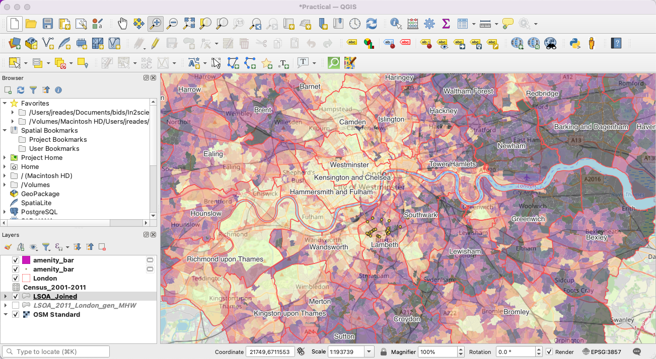
- See if you can figure out how to make the visible LSOA layer partially transparent so that you can see the OSM Standard map behind it. This will help you to orient yourself. Hint: it’s a
Symbologyoption. - Select the
Londonlayer and see if you can work out how to make the borough labels more visible. Hint: you probably need a buffer.
Here’s roughly what your map should look like:
2 Deriving a Variable
Let’s focus on house prices for a bit longer…
2.1 Change Between 2001–2011
How could we compare the amount by which house prices have changed in order to see where has changed the most? The simplest way would be to subtract one from the other, so let’s do that!
- Open the
Attribute Tableby right-clicking on the LSOA layer and selecting this option. - Scroll to the right until you can see the House Price data. The exact column names are:
Census_2001-2011_House Prices 2001andCensus_2001-2011_House Prices 2011. - Click on the
Field Calculator( )
)
3 Making a Comparison
4 Extending Your Map
You don’t need to rely on me to tell you how to do everything: often, with open source software, Google, Stack Overflow, and other online resources are your friend.
Taking one of your OSM point layers from Part 1, I’d like you to create a heatmap of that point data. Try Googling qgis make heatmap and see where you get to on your own!
Working out how to continue learning independently is absolutely critical in university!
5 Outputting a Map
Last thing for the day: let’s output a map!
The movie will show you how to output a (bad) map because there are a lot more dials to twiddle in order to get the map looking good!
Footnotes
You might also find it interesting to play with the number of
Classes– some schemes won’t let you, others will allow you to pick any number!↩︎